Visualisation for Fraud Detection & Prevention
7 November 2019
“Assessments of change, dynamics, and cause and effect are at the heart of thinking and explanation. To understand is to know what cause provokes what effect, by what means, at what rate. How then is such knowledge to be represented?” (Tufte: Visual Explanations).
Visual/Analytical Techniques
There is a long and rich history of visualising information to help us understand complexity; this includes graphs, maps and diagrams. Of particular interest, Visual Investigative Analysis utilises visual techniques as a fundamental part of the investigative process in both law enforcement and intelligence communities all around the world.
Who’s using it?
In addition to the above, it is becoming commonplace to find these same techniques used in the commercial sector looking at areas such as:
- Banking
- Insurance
- Credit Card Fraud
- On-line sales
- Counterfeit Products
- Piracy
How does it help?
You may have identified an issue, say an incident of fraudulent activity, and now need to understand who may have carried out the fraud, how it was done, how often it has occurred and, perhaps, if it is likely to happen again in the future. Creating visual charts that focus on the relationships (or Links) between things (Entities) is a very powerful and effective method of analysis; and is able to show complexities that would be impossible to realise simply by looking at rows of data in Excel.
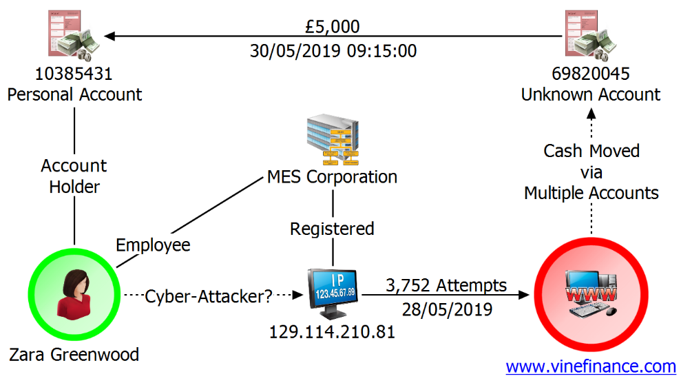
An example Visualisation – An Association, Link, or Network Chart
Here is an example chart summarising a cyber-attack on the fictitious www.vinefinance.com. The company’s financial systems were hacked, and significant amounts of money were fraudulently obtained.
Zara Greenwood is a suspect. She is an employee of MES Corporation. Their server has been used to launch the attack and facilitate the fraud. Analysis of Greenwood’s account shows she received substantial payments from an anonymous account shortly after the hack occurred.
What can I identify?
In many frauds we often want to identify something that is a common factor – this often includes people, bank accounts, addresses, email address, or phone numbers. Using visualisation software may be the key to finding that commonality. You can use the software to import data from different sources, standardising the data as you go.
Analytical Charts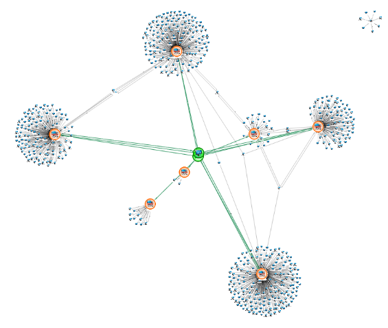
In the following chart there are some Entities in the centre in green (we have added the colour to help you see them). They are interesting because they are common to 7 other Entities on the chart (framed in orange): The Entities in green may be a good place to focus our initial investigation.
What if I can’t see it?
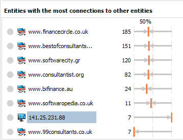
There comes a point where just visualising data isn’t enough – there is too much data, and it is too complex. Some software applications provide tools to allow you to ask key questions. A few examples include:
Listing the most connected Entity:
In the chart above we can use this to identify the Entities in green, even if we couldn’t “see them” immediately.
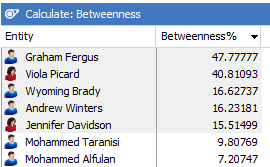
Which Entities may have the role of gatekeeper between different parts of the organisation?
Social Network Analysis
Social network analysis may help with this question – here the software calculates the values based on the chart and shows the results in a sorted table:
What is normal behaviour in my data; what is unusual?
Here is bar chart generated from a visual chart that covers a month of data for an activity. The activity could be any type of event (such as a transaction, IP traffic, email, call records etc).
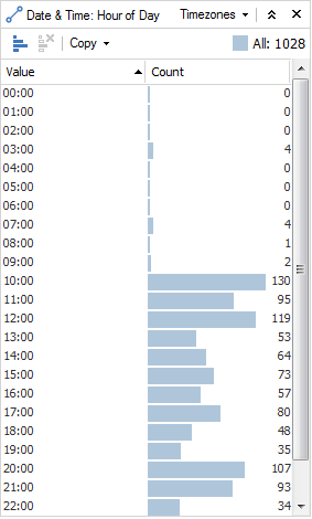
If we are looking at the activity organised by the hour of day, we can see that usual activity starts around 10 AM and continues throughout the day and evening. We could suggest then, that some ‘unusual’ activity occurs at 3 AM.
This can give us a quick insight into our data and by using this alongside the main visual chart we could see where in the network this unusual behaviour is taking place.
IBM i2 Analyst’s Notebook
These examples have been created using IBM i2 Analyst’s Notebook which is used to undertake data agnostic complex analysis, as well as produce presentation charts (both timeline and association) as high-quality intelligence products.
All data used in above is fictional and any names that are used are not related to any entities that may exist.
PREVIOUS POSTNEXT POST
324,000 fraud cases and no sign of slowing down
8 November 2019
TruNarrative uses Fraudscape data to offer expert insight into why 324,000 fraud cases are recorded annually with no sign of slowing down…what are the biggest fraud threats and who is falling victim?
CONTINUE READING
Contact centres: balancing happy customers and fraud prevention
5 November 2019
Smartnumbers share their expertise and insight around the topic of caller identification. New technology makes it easier than ever to manipulate calls, identifying callers by their phone number is no longer effective.
CONTINUE READING
Back to blog home >
